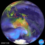
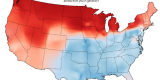
NASA Releases Updated Video Showing Temperatures Since 1880
By Ben • Uncategorized • 9 Feb 2012
via ecogeek.org
"Red in the video represents temperatures higher than the average during the 1950 - 1981 baseline period while blue represents temperatures lower than that average."


Tags: climate change, nasa, temperature, video
Recent Posts
- Incredible Images of our Amazing Star: 5 Years & 2,600 Terabytes
- That greenish mineral? Trilobite poop.
- Flying through the Solar System at the speed of light
- Animation: Pollution is never a local issue
- Animated World Cup 2014 highlight reel
Popular Posts
-
Are you Rob Base? (a helpful flow chart)
Nov 22, 2011

-
The Power of Books
Oct 02, 2013

-
American Dialect Differences: A Fascinating Time Suck
Jun 11, 2013
-
50 Years, 50 Popular Toys
Dec 20, 2013

-
That greenish mineral? Trilobite poop.
Feb 10, 2015

-
The Solar System to Scale (includes some TNOs)
Mar 05, 2013

-
Discarded Images: A collection of bizarre medieval images
Apr 25, 2013

-
Creepy 3D gifs
Jul 08, 2014

Top Tags
- video (81)
- funny (48)
- infographic (43)
- science (37)
- clever (34)
- education (34)
- astronomy (22)
- physics (20)
- nasa (18)
- geology (16)
- mashup (15)
- baseball (15)
- photography (14)
- poster (13)
- music (13)
- music video (12)
- map (12)
- time lapse (12)
- history (12)
- volcanoes (11)
- cartoon (11)
- animation (11)
- interesting (10)
- xkcd (10)
- GIFs (10)
Recent Comments
- on Toowoomba Flood 2011.01.10
- on American Dialect Differences: A Fascinating Time Suck
- on The United States redrawn as 50 States with Equal Population
- on Inverse relationships involving facial hair
- on 7 Yr Old Audri's Awesome Rube Goldberg Monster Trap
Archives
- February 2015
- July 2014
- June 2014
- April 2014
- February 2014
- December 2013
- November 2013
- October 2013
- September 2013
- August 2013
- July 2013
- June 2013
- May 2013
- April 2013
- March 2013
- February 2013
- December 2012
- November 2012
- October 2012
- September 2012
- August 2012
- July 2012
- June 2012
- May 2012
- April 2012
- March 2012
- February 2012
- January 2012
- December 2011
- November 2011
- October 2011
- September 2011
- August 2011
- July 2011
- June 2011
- May 2011
- April 2011
- March 2011
- February 2011
- January 2011

